Case study: GitHub documentation feedback system
How GitHub collects user feedbacks about its documentation pages with a step by step guide to replicate it in your own documentation with Feelback
In this article we’re going to analyze the GitHub documentation feedback system, how it works and how to add a similar system on your website.
How GitHub documentation collects feedback
At the end of each article, the GitHub documentation asks the user to evaluate the page. If you scroll down to the bottom, the page displays a question:

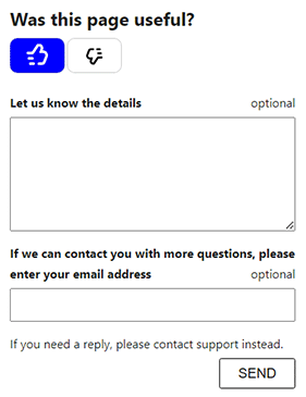
When the user click either the thumb up or thumb down button, nothing is sent yet. Instead, a small form appears. A textarea where the user can type on optional message and an email field. Both are optional to fill before sending the feedback.
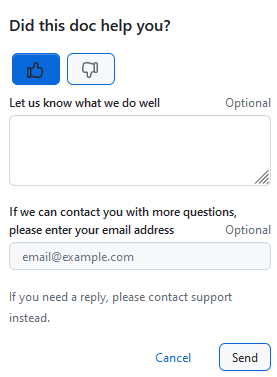
Let’s analyze in detail how the GitHub feedback collection works.
Where is asked?
GitHub documentation asks for feedback in all article pages. Some index, landing or marketing page doesn’t have a feedback form because, of course, it’s not the purpose of page. But, as a common convention, each documentation page includes the feedback question Did this doc help you??.
Each documentation page provides valuable information to the user, so it’s useful to know what the user thinks about that information.
What is collected?
The GitHub documentation feedback is quite simple. It’s composed by three fields:
- a sentiment: positive or negative
- a text message
- an email
To let the user express their evaluation quickly, the UI presents first the question with the two button first.
As last bit of emphasis, GitHub choose to have both the message and the email optional. Useful for committed users, but making them optional will further reduce the user psychological load and will result in an higher volume of feedback collected.
How is asked?
GitHub asks to evaluate the page by providing a detailed message. To ease the process, a simple leading question reveals the optional message that can be sent.
The short question with a simple Like/Dislike choice is easily understood by the user, just with a glance. The common thumbs up / thumbs down buttons further help to communicate what is the expected interaction with familiar elements. In addition, the reveal mechanism reduces the user friction caused by a larger quantity of information to parse and digest. The less the info, the more likely the user will understand and act upon.
How to add a GitHub-like feedback system in your website
We’re going to use Feelback to easily add a GitHub-like feedback system on your website. In particular, we’ll use the Tagged Message feedback to collect categorized messages from your users.
Step 1: Project setup
If you don't have already a Feelback account, please signup and create one. It's free and doesn't require a credit card to use.
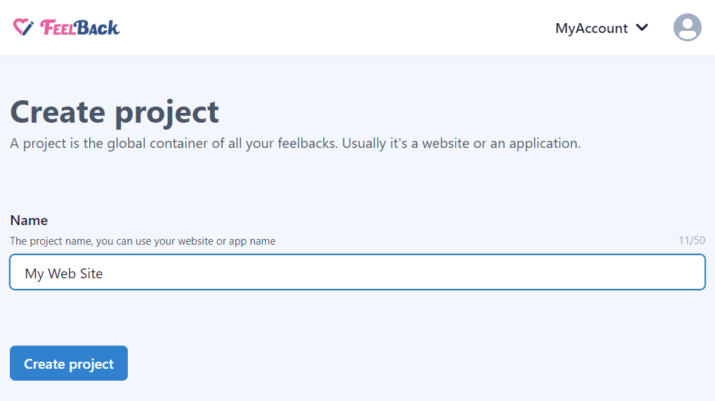
Access the Feelback panel, and create a project if you don't have any.
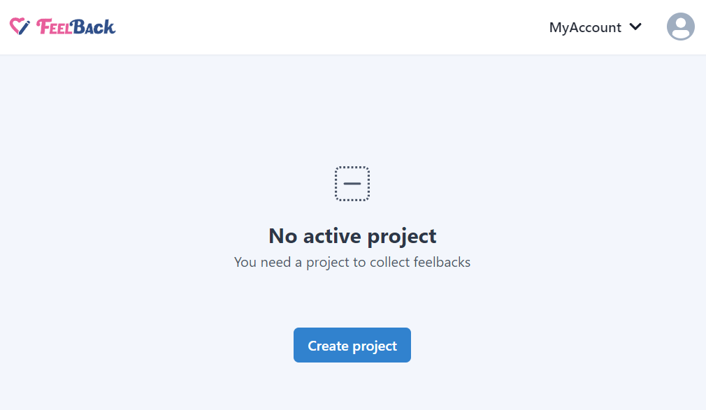
You can use your website name.
After that, create a ContentSet which will contain your content and feedbacks you will receive.
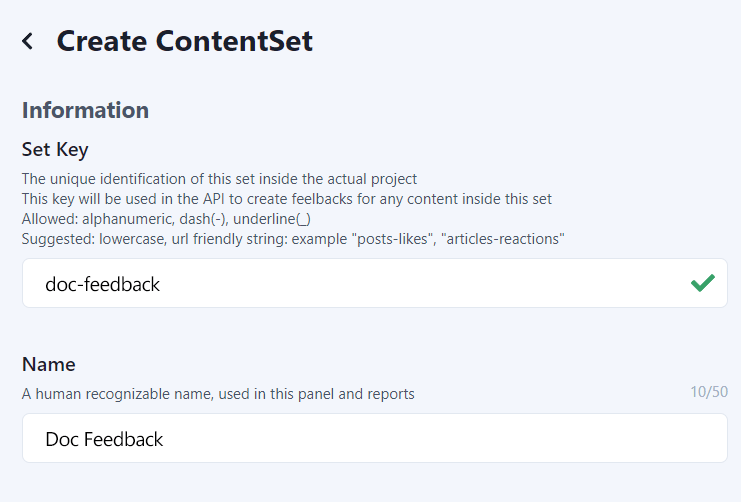
Pick the Tagged Message type to enable this content-set to receive categorized feedback message signals.
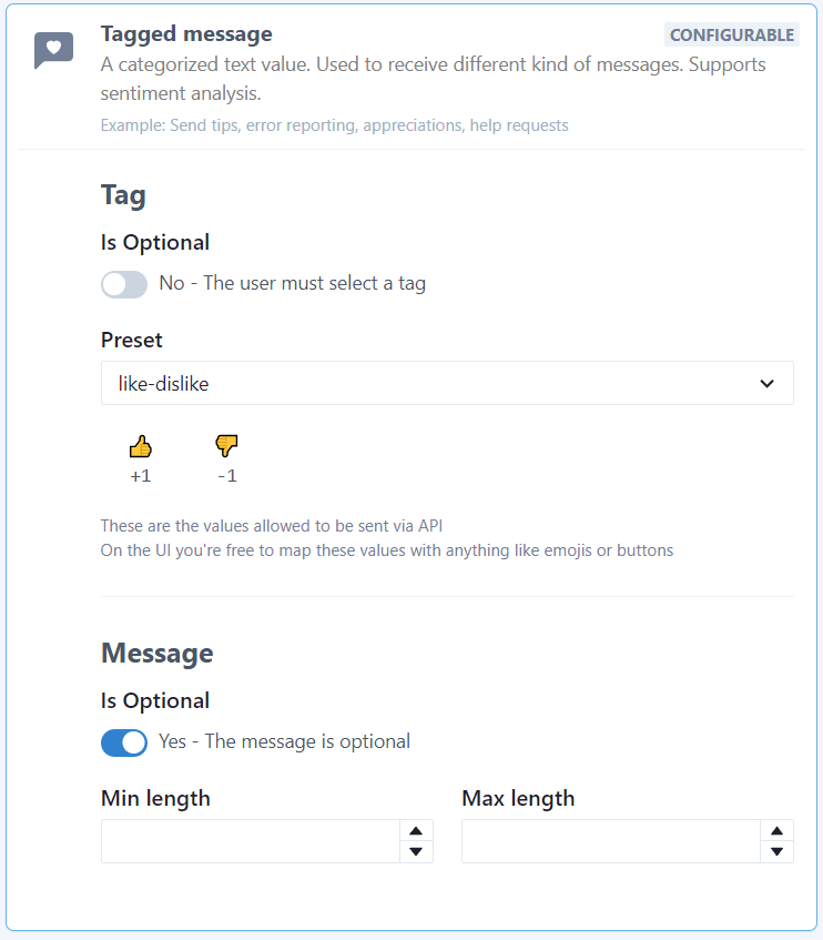
You will end up with a ContentSet like the following one:
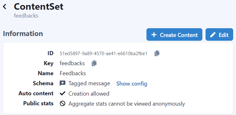
Step 2: Install the Feelback plugin
For this guide we’re going to assume you have a React-based website. Therefore, the next steps will focus on how to integrate a Feelback React component.
If your website is not build with React, Feelback offers integrations with many different libraries, static generators and site builders, where the same steps outlined here will apply.
For React, Feelback provides the dedicated @feelback/react integration package. In your project directory, you can install it with your preferred package manager:
npm install @feelback/reactpnpm add @feelback/reactyarn add @feelback/reactStep 3: Add the FeelbackTaggedMessage component to the layout page
Now you are ready to collect feedback for your article pages. Let’s suppose you have a Article component for the documentation page.
Just import the FeelbackTaggedMessage component and add it at the end of the article content.
import "@feelback/react/styles/feelback.css";
import { FeelbackTaggedMessage, PRESET_LIKE_DISLIKE } from "@feelback/react";

export function Article() {
    return (
        <article>
            {/* article content here */}
            <hr />
            <FeelbackTaggedMessage contentSetId="$content-set-id-from-panel"
                preset={PRESET_LIKE_DISLIKE}
                layout="reveal-message"
                title="Was this page useful?"
                placeholder={false}
                withEmail
                placeholderEmail={false}
            />
        </article>
    );
}
This will create the initial structure. But, like in the GitHub documentation, we miss the descriptions around the fields.
Let’s fix this. We can provide the same description by passing additional components using the slots property.
<FeelbackTaggedMessage contentSetId="$content-set-id-from-panel"
    preset={PRESET_LIKE_DISLIKE}
    layout="reveal-message"
    title="Was this page useful?"
    placeholder={false}
    withEmail
    placeholderEmail={false}
    slots={{
      BeforeMessage:
        <div className="small-text mt-2">
          <b>Let us know the details</b>
          <span className="float-right">optional</span>
        </div>,
      BeforeEmail:
        <div className="small-text mt-2">
          <b>If we can contact you with more questions, please enter your email address</b>
          <span className="float-right">optional</span>
        </div>,
      BeforeFormButtons:
        <div className="small-text mt-2">
            If you need a reply, please contact support instead.
        </div>
    }}
/>
Step 4: Customize the style (Optional)
Now, let’s make the style more similar to GitHub with additional CSS.
We assume a custom.scss file is imported in your components.
custom.scss
.feelback-container {
  --max-width: 300px;
  text-align: left;

  .feelback-q {
    padding: 0;
    flex-direction: column;
    align-items: flex-start;
    gap: 0.25rem;
    margin-bottom: 0.5rem;

    .feelback-text {
      font-size: 1.2rem;
      font-weight: bold;
    }

    .feelback-btn {
      padding: 1.1rem 1.15rem;
      font-size: 1.2em;
      border-radius: 0.5rem;
      border: 1px solid rgba(125, 125, 125, .4);

      &.active:nth-child(1) {
        background-color: blue;
        color: white;
      }
      &.active:nth-child(2) {
        background-color: red;
        color: white;
      }
    }
  }
}
Full documentation with advanced customization is available at the React integration guide.
The result will look something like:

And, when one button is clicked, it reveals the form:
Analyze aggregated feedback data
You can access the Feelback panel and checkout your content performance. A content item is the target object of the user feedback. In this scenario, a content item is the actual page the user is browsing.
In the dashboard, you can quickly see which page performs better.

For each page you can analyze aggregated data, which include the feedback count received. You can go back and check historical data and change the aggregation period to week, month or year.
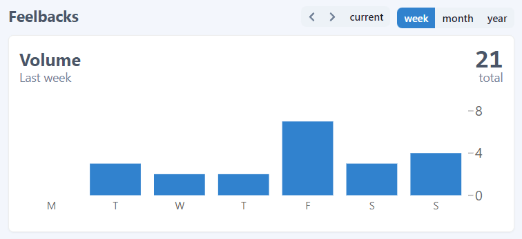
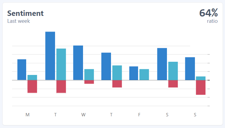
In this guide, we used the TaggedMessage to collect user feedbacks. And, because we configured sentiment values, Feelback creates sentiment aggregations too. For each page you can see the overall evaluation and the per Tag split.
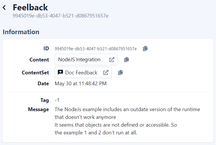
In addition to the aggregated view, you can go deep and analyze each single feedback. You can search, filter and check each feedback and see the details.
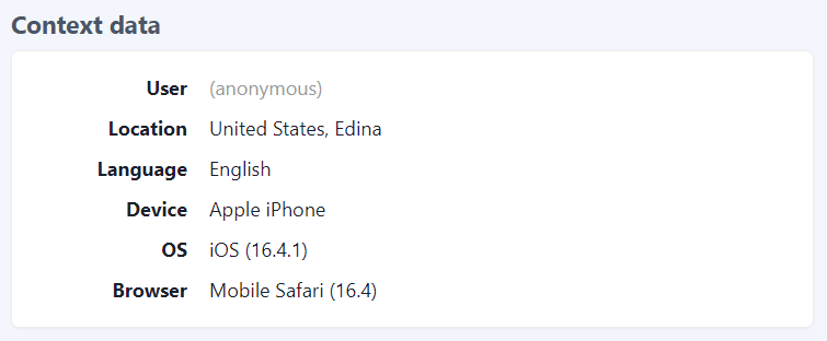
Each feedback comes with context data to further understand the relevance and specifics.
Additional resources
- Read the Feelback types list to know all signals you can receive from your users, from simple reactions or ratings to more complex error reporting or suggestion messages
- Checkout the integration guides to see all libraries, frameworks and website builder you can use with Feelback to collect user feedback